Clarity first. Conversions follow.
5.0★ Google Reviews | 700+ builds | 20+ years | No outsourcing

Hello, I’m Chris.
I create beautiful simplicity that packs a punch.
Your business may already do excellent work. Your website should make that obvious.
I combine beautiful simplicity, brand clarity, and minimalist design so the right people understand what you do, trust what they see, and know what to do next.
You work directly with me from strategy through launch. Nothing is outsourced.
Most Recent Project
Recent build below. Built to convert, not just look good.

Score: 98 Performance | 100 SEO | Speed Index 1.1s
Built to turn LinkedIn leads into clients:
- Conversion-first layout + clear CTA
- Proof placed where doubt spikes
- Speed-focused, lean stack
- WordPress custom build
- Tier 2: Momentum package
Good Work Should Not Look Ordinary
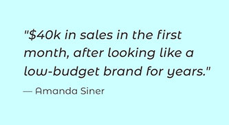
“Our old site made us look cheaper than we are. The new site finally matches the quality of our work and it’s helped us attract better paying clients. Now, we’re proud to send people to our site. Goodbye mediocre.”
— Jason Rutherford

Clarity Is the Competitive Advantage
People do not study a new site. They scan it.
In the first few seconds, they are trying to answer three questions:
- What does this business do?
- Can I trust it?
- What should I do next?
My job is to make those answers immediate.
That means clear messaging, disciplined design, strong proof, fast mobile performance, and one obvious next step.
A clean website without brand clarity still leaves people unsure. Good design and clear positioning have to work together.
Clean design without clear positioning is just decoration. I shape the message, audience, and visual hierarchy together so the website looks credible and makes sense fast.
Minimalism is not less design. It is less confusion.
The “No-Pressure” Design Guarantee
If you don’t like the direction after the first draft, I’ll fix it. It’s that simple. I’m not here to lock you into a design that doesn’t feel like “you.” We collaborate, we refine, and we launch with confidence. No ego, no pressure, no weirdness.
Why I Build This Way:
-
Built for the “Doers”: Local businesses, founders, online stores, consultants, coaches, service providers, trades
-
No Noise, All Signal: I remove the “creative ego” and focus on the message that actually triggers a sale.
-
The Branding Lens: I don’t just make it look “clean”; I ensure the design signals premium value so you can command premium prices.
-
Full Ownership: You lead your business; I lead the build. You get the premium results of a high-end agency without the ego, fluff, or billable-hour games. Just clear communication and a site that performs.
Selected brands I have worked with.
IN A  WORLD FULL OF NOISE, I HELP BRANDS
  STAND OUT WITH CLEAR IDEAS AND
  GOOD DESIGN THAT MAKE AN
  IMPACT.


Three Levels of Website Transformation

FOUNDATION
Professional Web Presence
For businesses that need to look established, credible, and easy to contact.
- 3 to 5 core pages
- Speed, security, and foundational SEO
- Contact form and analytics
Best for: Establishing credibility fast
MOMENTUM
★ Most Clients Start Here ★
Conversion Focused Growth Site
Everything in Foundation, plus:
- Structure that guides visitors toward action
- Proof and calls to action placed where hesitation appears
- Clarity edits, lead capture, FAQ, and booking flow
Best for: A website that produces results
FLAGSHIP
Complete Brand and Website System
Everything in Momentum, plus:
- Positioning that makes “why you” obvious
- A complete system for type, color, and voice
- Reusable content structure for future growth
Best for: Repositioning, raising prices, or building a larger presence
Not sure where you fit?
Start with Momentum. I will tell you honestly if you need more, or less.
5.0★ Google Reviews | 700+ builds | 20+ yrs | No outsourcing
10-Second Yes Method
Minimalism isn’t “less design.” It’s less confusion.
In the first 10 seconds, people aren’t reading. They’re scanning for:
(1) What is this? (2) Can I trust it? (3) What do I do next?

1) UX → The Path
Visitors immediately understand where they are, what you offer, and what to do next.
2) UI → The Look
Typography, spacing, contrast, and color make the business feel trustworthy.
3) Build → The Engine
A lean, fast website creates fewer breaking points and makes future updates easier.
If it does not move someone closer to a yes, it does not stay.
FAQs
Do I really need a website?
Only if you want success. People don’t “just call” anymore… they verify first. If they can’t quickly tell you’re legit, they move on. Your competitor isn’t better. They just look safer in 10 seconds.
Here’s the reality:
87% of customers research online before buying… especially local services. They want to see if they can trust you. A website isn’t about being fancy. It’s about being the obvious safe choice after they Google you.
Why shouldn't I just use a $500 site or Wix / Squarespace?
You could. Allow me to be brutally honest with you. At best, a $500 site looks like generic “business card” (at best). Most of the time it looks like their little nephew tried to start a business. In truth, YOU wouldn’t buy a thing from a $500 website. My websites are like a Smart Sales Team with a mastery of human behavior.
Cheap sites are usually slow, hard to use on mobile, and hemorrhage leads quietly. When you’re losing $500-$5,000 a week in missed revenue, that “cheap” site becomes the most expensive mistake you’ll ever make.
Do you write copy?
Yes. I offer copy shaping by default: headlines, structure, clarity edits, and persuasion upgrades. It’s like taking your ingredients (existing copy) and turning them into a clean, high-converting dish.
Ghostwriting is when you don’t bring ingredients… I cook the whole meal: full pages written from scratch. Ghostwriting is included in Mothership, and available as a paid add-on for Motivation or Momentum.
How fast can we launch?
Motivation can move fast once you complete my branding questionnaire and your core content is in. Momentum and Mothership take longer because we’re tightening structure, proof, and messaging. Not just “making pages.”
That said, I don’t drag my feet. I build with urgency (work ethic courtesy of my father).
What do you need from me?
Less than you think. Start with my Branding Questionnaire and send any existing text, photos, or logos you have. If you don’t have much, that’s not a roadblock… I can work with what you have and create the rest.
If you’re too busy to build a site yourself, you’re my ideal client.
WordPress or Shopify → how do I choose?
Shopify is best for ecommerce. WordPress is best for most service businesses and content-heavy sites. If you’re unsure, I’ll recommend the right platform based on your business model and goals.
Why only these two (not Wix, GoDaddy, etc.)? Because they’re the most reliable for what matters: speed, mobile performance, customization, and long-term stability.
They also give a professional designer the most flexibility for customizations. I am extremely limited in my ability to make a Wix site look custom and professional-grade. And you don’t want the templated-look if you’re competing as a serious business.
Finally, it’s easy for average person to handle simple updates (like quick text edits) without breaking anything… saving you time + money.
Do you outsource to other web designers?
No. You work directly with me. That’s central to my brand.
Do you offer payment plans?
Yes, payment plans are available for qualified projects.
The Motivation package is split into three milestones: 50% to start, 25% mid-project, 25% at completion.
For the Momentum + Mothership packages, extended plans (3–6 months) are available; a 7% plan fee applies.
A Project Start Retainer is required to begin, and the final balance is due before launch/handoff.
What's a Project Start Retainer?
I use a Project Start Retainer to kick off every project… not a deposit. There’s an important difference.
A deposit implies money you might get back. A retainer reflects the reality that work begins the moment I accept your project:
- intake review,
- technical assessment,
- site planning,
- scheduling,
- holding production time that I can’t give to another client (revenue lost on my end).
+++
That’s why the retainer is non-refundable. If plans change, it can be applied as a credit toward future services within 6 months.
Chris Built These


Meet Chris
I’m a web designer, brand strategist, and longtime business owner.
Over 20 years and more than 700 builds, I have learned how quickly unclear messaging and weak presentation can make an excellent business look ordinary.
My background includes advanced marketing study at the University of Michigan’s Ross School of Business, along with firsthand experience building seven businesses and successfully exiting three.
I bring an owner’s mindset to every project: clear priorities, disciplined scope, direct communication, and design decisions tied to trust and action.
You work directly with me from strategy through launch. Nothing is outsourced.

The Advantage:
-
Owner’s Mindset: I’ve built 7 businesses and successfully exited one for 317% above market value. I look at your site through the lens of an acquisition, not just an aesthetic.
-
Academic Precision: As a Ross School of Business alum (University of Michigan), I embed MBA-level strategic insights into your website.
-
Minimalist Philosophy: I specialize in high-impact, low-friction solutions that lead to faster launches and sustainable, low-maintenance growth.
My Ideal Client
I work best with entrepreneurs who value precision over fluff. You are a fit for my direct-to-founder model if:
-
You value autonomy: you want a self-starter who handles the details.
-
You prioritize clarity: you know simple and clean beats clutter.
-
You seek ROI, not just a price: you’ll pay fair for elite craftsmanship that performs.
-
You think long-term: you want a loyal partner, not a one-off transaction.
-
You support local: you prefer specialists and community over megaservices.
*If you want the cheapest option or need a site by tomorrow, I’m not your guy.
Design Direction Promise
You will see the visual direction before the full site is completed.
If the first direction does not feel right, I will refine it within the agreed scope before moving forward. Don’t worry, I got you.
You will also receive written pricing, scope, and timing before the project begins, so there are no surprise charges or moving goalposts.
Clear expectations. Direct communication. No disappearing act.
Trusted by the Trusted
Ready for the Easy Yes?
Answer some quick questions. You will receive a clear recommendation, a firm quote, and a written scope from the person who would actually build your website.